Search
A search interface with faceted filtering. Contains a child listing block for results and typed facets (checkbox, select, date range, toggle) for filtering.
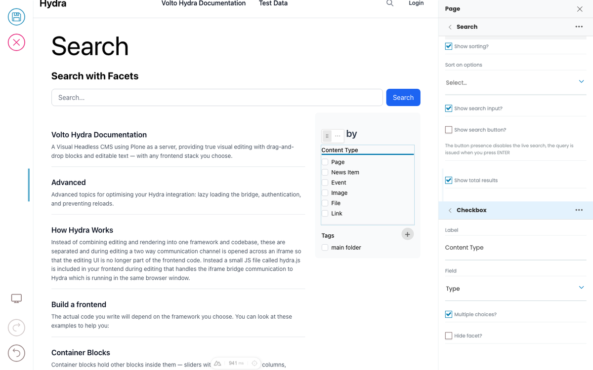
Search with Facets
Filter by
Button
The button block shows a button for which a link (internal or external) can be stored. The button can be displayed left, right or center and have a background color.
News Item
The News Item content type can be used to display News content on the website.

Image - Light
The Image content type can be used to upload an image in various formats (JPG, GIF, PNG, SVG). The uploaded image should always have a high resolution so that it can be used flexibly, for example as a banner image. Plone automatically delivers the images in the best scaling, so there is no need to scale images down manually.
Image
The Image content type can be used to upload an image in various formats (JPG, GIF, PNG, SVG). The uploaded image should always have a high resolution so that it can be used flexibly, for example as a banner image. Plone automatically delivers the images in the best scaling, so there is no need to scale images down manually.
Hydra demo (homepage hero)
Homepage hero loop showing live editing, formatting, drag-and-drop, container selection, and the frontend switcher.
Simple Search
Templates and layouts
A template is a piece of pre-built page structure that someone (often a developer or site admin) has saved separately. When you apply a template to a page, the page gets the template's structure overlaid: some blocks are fixed and can't be edited, some can be edited but not moved, and some are open slots where you fill in your own blocks.
Selecting blocks
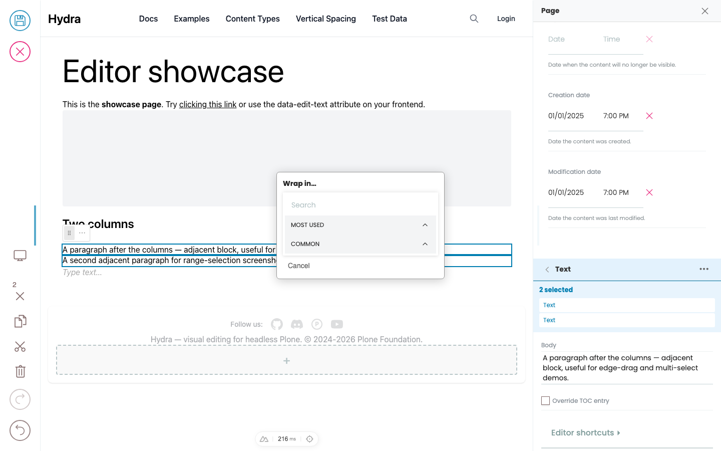
The editor has two modes when a block is selected: text mode (you're editing inside the block) and block mode (the whole block is selected as a unit).
Links and media
The link picker, image picker, and upload dialog are part of Hydra's chrome — they look the same on every site. What varies by design system is which links and images are click-to-edit in the preview: a site might wire up every link inline, or only a few "primary" links, with everything else editable from the sidebar. Same applies to images.
Editing text
Click into any text in the preview that's marked inline-editable and start typing. There are two kinds of text fields: simple text (like a title) and slate (rich text — the body of a paragraph block, descriptions, etc.).
Containers
A container block holds other blocks inside it — sliders, columns, accordions, grids, generic sections. The blocks inside are called its children. Containers can be nested (a column inside a row inside a section).
Adding and moving blocks
The block chooser, slash menu, and drag handles are part of Hydra and look the same everywhere. What you can pick from those choosers — the list of block types — comes from your site's design system. One site might offer "Lead paragraph", "Pull quote", "Stat highlight"; another might just have "Text" and "Image". Mechanic is identical.
Developer Reference
Schema
Pass this object inside the blocks option when calling initBridge() to register this block type with the admin UI. See Custom Blocks for the full setup guide.
{
  "search": {
    "blockSchema": {
      "properties": {
        "facetsTitle": {
          "title": "Facets Title"
        },
        "facets": {
          "title": "Facets",
          "widget": "object_list",
          "typeField": "type",
          "allowedBlocks": [
            "checkboxFacet",
            "selectFacet",
            "daterangeFacet",
            "toggleFacet"
          ]
        },
        "listing": {
          "title": "Listing",
          "widget": "blocks_layout",
          "allowedBlocks": [
            "listing"
          ]
        }
      }
    }
  },
  "checkboxFacet": {
    "blockSchema": {
      "properties": {
        "title": {
          "title": "Label"
        },
        "field": {
          "title": "Field",
          "widget": "select_querystring_field"
        },
        "multiple": {
          "title": "Multiple choices?",
          "type": "boolean",
          "default": false
        },
        "hidden": {
          "title": "Hide facet?",
          "type": "boolean",
          "default": false
        }
      }
    }
  },
  "selectFacet": {
    "blockSchema": {
      "properties": {
        "title": {
          "title": "Label"
        },
        "field": {
          "title": "Field",
          "widget": "select_querystring_field"
        },
        "hidden": {
          "title": "Hide facet?",
          "type": "boolean",
          "default": false
        }
      }
    }
  },
  "daterangeFacet": {
    "blockSchema": {
      "properties": {
        "title": {
          "title": "Label"
        },
        "field": {
          "title": "Field",
          "widget": "select_querystring_field"
        },
        "hidden": {
          "title": "Hide facet?",
          "type": "boolean",
          "default": false
        }
      }
    }
  },
  "toggleFacet": {
    "blockSchema": {
      "properties": {
        "title": {
          "title": "Label"
        },
        "field": {
          "title": "Field",
          "widget": "select_querystring_field"
        },
        "hidden": {
          "title": "Hide facet?",
          "type": "boolean",
          "default": false
        }
      }
    }
  }
}
JSON Block Data
Example JSON as stored in the Plone content API. This is the data structure your component will receive in the block prop.
{
  "@type": "search",
  "facetsTitle": "Filter by",
  "facets": [
    {
      "@id": "facet-1",
      "type": "checkboxFacet",
      "title": "Content Type",
      "field": "portal_type",
      "multiple": true,
      "hidden": false
    },
    {
      "@id": "facet-2",
      "type": "daterangeFacet",
      "title": "Date Range",
      "field": "effective",
      "hidden": false
    }
  ],
  "blocks": {
    "listing-1": {
      "@type": "listing",
      "variation": "summary",
      "querystring": {
        "query": [
          {
            "i": "portal_type",
            "o": "plone.app.querystring.operation.selection.any",
            "v": [
              "Document",
              "News Item"
            ]
          }
        ]
      }
    }
  },
  "blocks_layout": {
    "listing": [
      "listing-1"
    ]
  }
}
Rendering
How this block renders in your frontend. Add its handling to your renderer, or — for list-style blocks — register a fetcher and reuse your list rendering.
function SearchBlock({ block, blockId }) {
  const [query, setQuery] = useState('');

  const facets = (block.facets || []).filter(f => !f.hidden);
  const listing = block.blocks_layout?.listing || [];
  const listingId = listing[0];
  const listingBlock = listingId ? (block.blocks?.[listingId]) : null;

  return (
    <div data-block-uid={blockId} className="search-block">
      {block.headline && <h2 data-edit-text="headline">{block.headline}</h2>}
      <input
        type="search"
        placeholder="Search..."
        value={query}
        onChange={e => setQuery(e.target.value)}
      />

      {facets.length > 0 && (
        <div className="facets">
          <h4 data-edit-text="facetsTitle">{block.facetsTitle || 'Filter'}</h4>
          {facets.map(facet => (
            <FacetRenderer key={facet['@id']} facet={facet} />
          ))}
        </div>
      )}

      {listingBlock && (
        <ListingBlock block={listingBlock} blockId={listingId} />
      )}
    </div>
  );
}

function FacetRenderer({ facet }) {
  switch (facet.type) {
    case 'checkboxFacet':
      return <fieldset data-block-uid={facet['@id']}><legend data-edit-text="title">{facet.title}</legend>{/* checkbox options */}</fieldset>;
    case 'selectFacet':
      return <label data-block-uid={facet['@id']}><span data-edit-text="title">{facet.title}</span><select>{/* options */}</select></label>;
    case 'daterangeFacet':
      return <label data-block-uid={facet['@id']}><span data-edit-text="title">{facet.title}</span><input type="date" /> – <input type="date" /></label>;
    case 'toggleFacet':
      return <label data-block-uid={facet['@id']}><input type="checkbox" /> <span data-edit-text="title">{facet.title}</span></label>;
    default:
      return null;
  }
}